Case Study
Olay
Olay
“Twin Study”
Visualizing a gamified physical experience where a Fifth Avenue storefront, a live interactive display, and real human reaction became the proof of product.
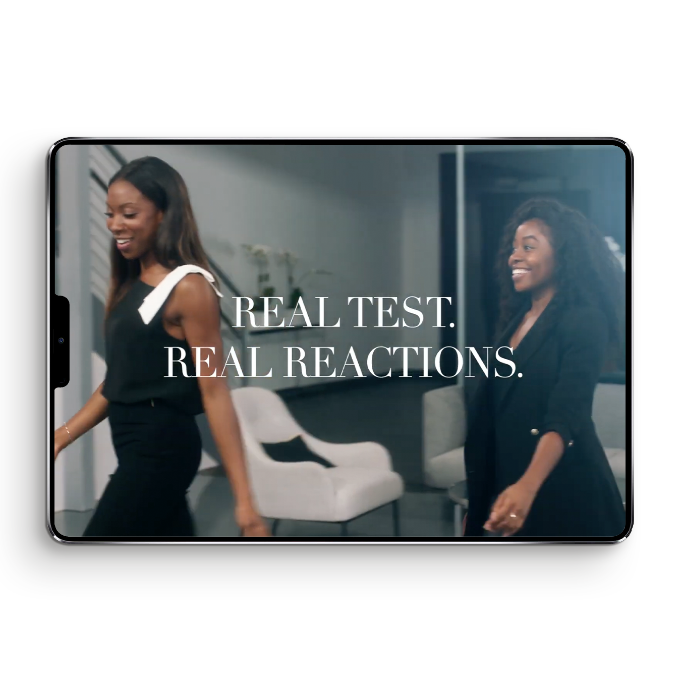
Visualizing a gamified physical experience where a Fifth Avenue storefront, a live interactive display, and real human reaction became the proof of product.
Some campaigns are filmed. This one was designed. Saatchi & Saatchi wanted to prove Olay’s 28-day skin transformation not through a scripted spot, but through an immersive physical experience — a gamified Fifth Avenue storefront where real women would move through a designed space, interact with a live digital display, and react to a reveal that made the product truth undeniable. Before any of it could exist, someone had to visualize the whole thing — the space, the flow, the interaction, the human moment at the center of it. That was the work. Raucous Content was selected to produce it.
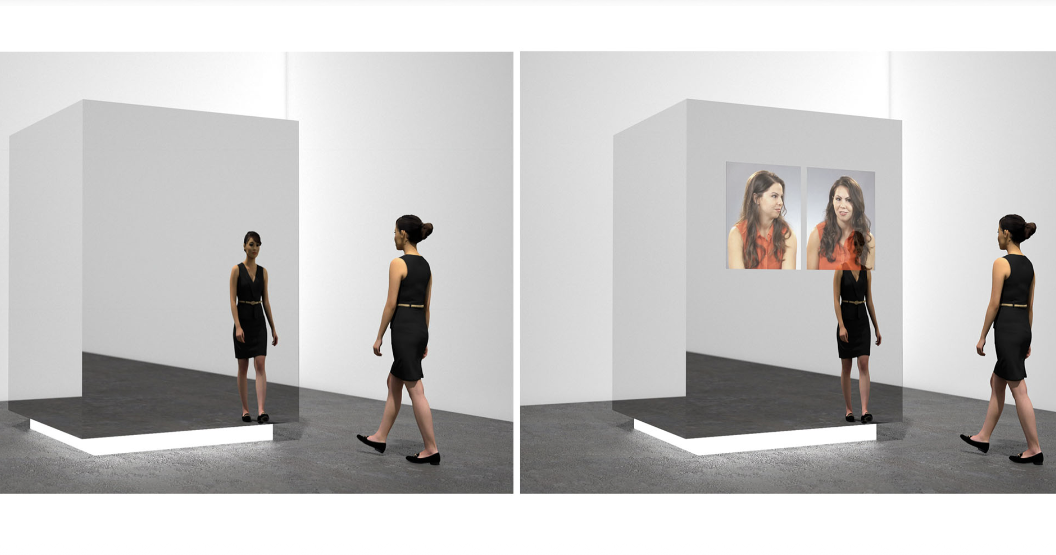
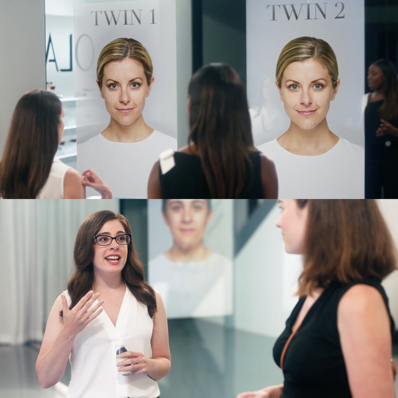
The concept began on the street. A Fifth Avenue storefront — its windows covered in vinyl prints of identical twins — draws real women in from the sidewalk. Inside, a bright gallery-like space centers on a large mirrored monolith. Is it a mirror? An art installation? People explore it before they even know what it is. A host introduces the Twin Study: one of these identical twins used Olay for 28 days. The other did not. Can you tell which one? The mirrored display activates — two digital screens dissolve from still images to live video. The twin steps out of the screen and into the room. Real women, real reactions, real proof. The campaign wasn’t filmed. It was designed and then captured.
Full visual document design across 15 pages — covering the big idea, the interactive display system, store interior, art direction, look and feel, casting strategy, and host direction. Each section designed to guide Saatchi & Saatchi through the experience as if they were already inside it.
Spatial experience visualization — communicating a physical installation before it was built, including 3D diagrams of the interactive display, spatial flow references, and a store interior mood board that established the visual language of the space as “one part gallery, one part premium pop-up shop.”
Visual tone and reference curation — sourcing imagery that balanced Olay’s prestige beauty aesthetic with the raw authenticity of real women reacting genuinely. The document had to feel simultaneously high-end and human — striking a balance between real and retouched.
Narrative sequencing — structuring the document so the reader moved through the concept in the same order a real user would experience it. Street. Storefront. Entry. Display. Reveal. Reaction. The document itself was a user journey.

Pitch Won — Raucous Content selected by Saatchi & Saatchi to produce the campaign.
Produced + Aired — The campaign was produced and released nationally for one of the world’s most recognized beauty brands.
Ego Nwodim — The host vision was realized — Ego Nwodim hosted before joining Saturday Night Live’s cast.
Saatchi & Saatchi — One of the world’s most celebrated agencies trusted this vision to bring their most experiential concept to life.
Of all the treatments I’ve worked on, this one is the closest to pure experience design. The Twin Study wasn’t just a TV spot — it was a physical user journey. Someone walks down Fifth Avenue. A storefront catches their eye. They enter. They’re guided through a space designed to build curiosity. They interact with a mirrored display. A reveal happens. They react. The entire concept was built around designing a sequence of moments that moved a real person through a specific emotional arc — surprise, delight, belief.
Communicating that journey — the spatial layout, the technology interaction, the emotional beat of the reveal, the way light and camera would capture authentic human reaction — required the same thinking that drives great UX work. User flow. Environmental design. Information hierarchy. Emotional sequencing. The medium was a pitch document. The discipline was designing an experience for real people that worked exactly as intended the first time they encountered it.
What stays with me about this project is that the most important design decisions happened before any camera rolled — in the document, in the sequencing, in the choice of what to show and in what order. The woman walking off Fifth Avenue into that storefront had no idea she was about to be part of something designed. That’s when design works. When people don’t notice it at all.