Most coffee apps are built for scale. Kaffe was built for culture. A 0-to-1 mobile product for discovering independent coffee shops and the communities that form around them. Built end to end, with nothing borrowed and nothing left unfinished.
The Challenge
Finding a great local coffee shop shouldn’t require scrolling past Starbucks three times. Apps like Yelp and Google Maps are built for scale which means independent coffee shops with no marketing budget get buried under chains, sponsored listings, and algorithmic noise. For people who actively want to support local businesses, find a reliable workspace, or belong to a community that forms around these spaces there was no dedicated place to look.
But the discovery problem is only half of it. The deeper gap: there’s no product that treats the independent coffee shop as a community anchor. A place where your running group ends up after a Saturday 10K. Where someone posts an AeroPress guide that changes how you brew at home. Where you’re a regular, not just a customer. Existing apps optimize for the transaction. Kaffe was designed around the ritual.
The Solution
Kaffe is a mobile app built exclusively for independent local coffee shops — no chains, no sponsored results, no noise. Filters are built around how people actually use coffee shops: remote work, pet-friendly spaces, community events, and pickup orders. The goal wasn’t just discovery, it was building a platform where the people who care about local businesses can find the spaces that care back.
Who I Designed For
Nichole, 26 — Project Manager
Primary User
Works remotely from coffee shops daily. Wants to support local but wastes time filtering chains out of existing apps. Needs reliable wifi, outlets, and a space that won’t rush her out — and she needs to know all of that before she leaves home.
“I wish there was an app that only showed local places — I already know where Starbucks is.”
Tyler, 34 — Writer
Community Seeker
New to the neighborhood, uses coffee shops to get rooted locally. Particular about vibe and quality. Wants an app that surfaces places worth caring about — not just places that are nearby.
“Is there an app just for small local businesses where people who actually care about this can connect?”
Johnny, 43 — Math Teacher
Neighborhood Explorer
Explores different neighborhoods on weekends to decompress. Loves hidden gems but current apps don’t give him enough upfront information — he shows up somewhere that isn’t what he expected. Wants transparency before committing to the trip.
“The apps I use aren’t transparent enough — I need to know what a place is actually like before I go.”
The Process
Paper first, pixels second
Everything started on paper. Before opening Figma, the full user journey was sketched and annotated across both flows — with navigation logic, interaction notes, and content hierarchy mapped by hand. The goal was to resolve the structural problems before designing the interface.
Paper wireframes surfaced early decisions: how the home screen needed to serve both discovery and community simultaneously; how the product customization screen could signal expertise without overwhelming; where the community flow split from the order flow and how they connected back. These decisions carried directly into low-fidelity and held through to high-fidelity.
Two flows, one system
The design scope was organized around two complete user journeys — each solving a distinct problem, each with its own emotional arc.
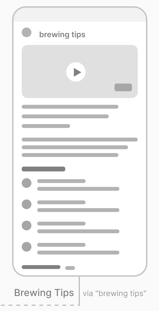
Home → Community Groups → Group Detail → RSVP Confirmed → Brewing Tips
11 screens total. Every screen was wireframed, validated for structure, then taken to high fidelity — with full interaction states accounted for across both flows.
AI-assisted design
I used Claude throughout as a thinking partner, pressure-testing user flows against persona needs, refining copy hierarchy, stress-testing design decisions, and accelerating documentation. AI-assisted workflows are increasingly part of how strong UX teams move fast without losing rigor. This project was built that way from the start.
Key Design Decisions
01
Coffee Shop of the Month as the anchor
Rather than opening with a search bar, the home screen leads with an editorial feature — a curated spotlight on one local shop. This immediately signals that Kaffe is opinionated and community-driven, not algorithm-driven. It sets the tone before the user does anything.
02
Community section on the home screen
Brewing tips and community posts sit on the home screen alongside discovery — not hidden in a separate tab. This reinforces that Kaffe is a platform, not just a directory. It gives users a reason to come back even when they’re not actively searching for a new shop.
03
Apple Pay / Google Pay as the primary payment path
The payment screen leads with wallet options above the card form not as an afterthought, not below the fold. Mobile-first users ordering coffee before a run are not filling out billing addresses. Friction removal at the point of highest intent was the design goal, and the payment screen was designed to reflect that.
04
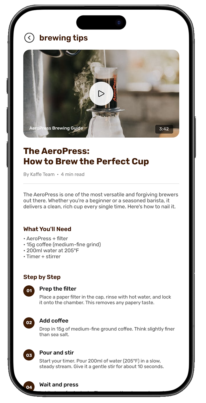
Brewing Tips as editorial content, not push notifications
The AeroPress guide was designed as a long-form article with a companion video, numbered step-by-step instructions, and a comment thread. This positions Kaffe as a resource, a platform users return to when they’re not ordering not just a utility they open when they want coffee.
From Low Fidelity to High Fidelity
The low-fidelity screens established the structural logic — information hierarchy, navigation patterns, and content groupings across both flows. Moving into high fidelity, the visual language was built to feel warm, editorial, and specifically not like a food delivery app.
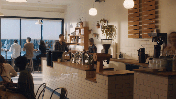
Real photography, a warm brown palette, clean typography, and generous white space were deliberate choices to communicate the quality and character of the shops Kaffe represents. The design system was built to scale consistent type hierarchy, reusable card components, and a color language that works across discovery content, order UI, and community screens without feeling fractured.
What Shipped
11
High-fidelity screens across 2 complete user flows
3
User personas grounding every design decision
→
Full order flow: browse → customize → cart → payment → confirmation
→
Full community flow: groups → group detail → RSVP → editorial content
✓
Clickable Figma prototype with interaction states
Reflection
Kaffe started as a product I wanted to exist. What surprised me was how quickly the constraints became the interesting part — the tension between discovery and community, between a casual first-time user and someone who already knows their order. Designing for both without flattening either was the actual problem. The screens were just how I showed the answer.